Results & Analysis
Interpret simulation outputs using histograms, statistics, and sensitivity analysis.
Histogram
Each output generates a histogram showing how results are distributed across iterations. The x-axis shows possible values; the y-axis shows frequency.
Insight badge
A label above the histogram indicates the distribution shape (Normal-like, Right-skewed, Bimodal, etc.). This helps you quickly understand the characteristics of your output and whether it matches expectations.
Statistics
Average of all outcomes.
Middle value. Less sensitive to outliers.
Spread around the mean.
Observed extremes.
5th and 95th percentiles. 90% of outcomes fall within this range.
Interquartile range. Middle 50% of outcomes.
Probability Calculator
Answer questions like "What is the probability that profit exceeds $50,000?" or "What value do we exceed 90% of the time?"
P(X > value)
Probability of exceeding a threshold.
P(X < value)
Probability of falling below a threshold.
Sensitivity Analysis
Identify which inputs have the greatest impact on outputs using Spearman rank correlation.
Tornado chart
Horizontal bars show correlation strength between each input and the selected output. Longer bars indicate greater influence on results. Positive values (extending right) mean higher input values lead to higher output values, while negative values indicate inverse relationships.
Interpretation
A correlation of 0.8 indicates strong dependence—changes in that input significantly affect the output. Values near 0 suggest minimal influence, meaning you can treat that input as less critical. Use this analysis to focus refinement efforts on the variables that matter most.
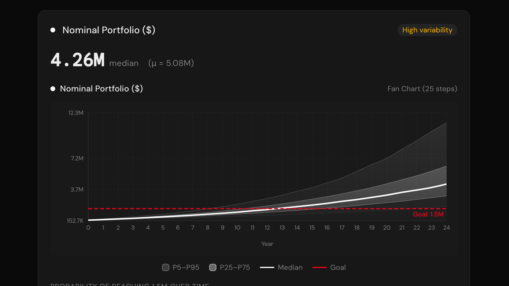
Time Series Charts
Time Series blocks generate additional visualizations showing how values evolve over time.
Fan Chart
Confidence bands (P5, P25, P50, P75, P95) across time periods. Band width indicates uncertainty.
Probability Chart
Probability of exceeding a target at each time step. Track goal achievement over time.
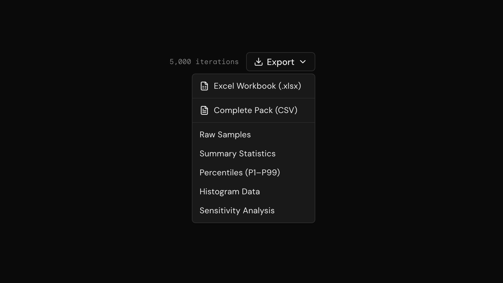
Export
Export results for further analysis or reporting.
Formatted workbook with statistics and raw data.
All data in CSV: samples, statistics, percentiles, histograms, sensitivity.
Individual iteration results.
Mean, median, std dev, and percentiles.
Bin counts and frequencies.
Correlation coefficients and rankings.